×
[PR]上記の広告は3ヶ月以上新規記事投稿のないブログに表示されています。新しい記事を書く事で広告が消えます。
plot(dnorm, -4, 4)
xvals <- seq(-4, 4, length=1000) # 領域をx軸方向に1000個の多角形(台形)に等分割
dvals <- dnorm(xvals) # 対応するグラフの高さ
polygon(c(xvals,rev(xvals)),
c(rep(0,1000),rev(dvals)),col="skyblue") # 塗りつぶす
参考というか自分用のコピペです。元は以下URL。感謝
http://cse.naro.affrc.go.jp/takezawa/r-tips/r/51.html
xvals <- seq(-4, 4, length=1000) # 領域をx軸方向に1000個の多角形(台形)に等分割
dvals <- dnorm(xvals) # 対応するグラフの高さ
polygon(c(xvals,rev(xvals)),
c(rep(0,1000),rev(dvals)),col="skyblue") # 塗りつぶす
参考というか自分用のコピペです。元は以下URL。感謝
http://cse.naro.affrc.go.jp/takezawa/r-tips/r/51.html
PR
right 引数
logical; if TRUE, the histogram cells are right-closed (left open) intervals.
デフォルトはright=TRUEで、より上~以下
right=FALSEにすると以上~未満
区間の下限(左側)は区間に含まれるが、上限(右側)は含まれない
デフォルトはこの逆
x <- c(1,2, 4,5)
par(mfrow=c(1,2))
hist(x)
hist(x, right=F)
Rjpwikiの色見本
http://www.okada.jp.org/RWiki/?%BF%A7%B8%AB%CB%DC
Chart of R Colors
http://research.stowers-institute.org/efg/R/Color/Chart/
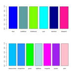
# 自分の使う色だけまとめる
cls <- c("blue", "cadetblue", "chartreuse", "cyan", "darkblue", "deeppink", "deepskyblue", "dodgerblue", "green", "lightblue", "magenta", "purple", "pink")
x <- rep(1,13)
names(x) <- cls
par(mfrow=c(2,1), cex=0.6)
barplot(x[1:6], col=cls[1:6])
barplot(x[7:13], col=cls[7:13])
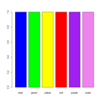
# 基本色
win.graph()
cls <- c("blue", "green", "yellow", "red", "purple", "violet")
x <- rep(1,6)
names(x) <- cls
barplot(x, col=cls)
http://www.okada.jp.org/RWiki/?%BF%A7%B8%AB%CB%DC
Chart of R Colors
http://research.stowers-institute.org/efg/R/Color/Chart/
# 自分の使う色だけまとめる
cls <- c("blue", "cadetblue", "chartreuse", "cyan", "darkblue", "deeppink", "deepskyblue", "dodgerblue", "green", "lightblue", "magenta", "purple", "pink")
x <- rep(1,13)
names(x) <- cls
par(mfrow=c(2,1), cex=0.6)
barplot(x[1:6], col=cls[1:6])
barplot(x[7:13], col=cls[7:13])
# 基本色
win.graph()
cls <- c("blue", "green", "yellow", "red", "purple", "violet")
x <- rep(1,6)
names(x) <- cls
barplot(x, col=cls)
par(mfcol=c(3,3))
plot(1:10, type="p", main="p") # points
plot(1:10, type="l", main="l") # lines
plot(1:10, type="b", main="b") # both. pointsとline
plot(1:10, type="c", main="c") # the lines part alone of "b"
plot(1:10, type="o", main="o") # overplotted. 線とポイントを重ねる
plot(1:10, type="h", main="h") # histogram
plot(1:10, type="s", main="s") # stair steps
plot(1:10, type="S", main="S") # other steps
plot(1:10, type="n", main="n") # no plotting
基本はもちろんRjpwikiのカラーチャートのページ。感謝
# 虹色はrainbow
barplot(1:7, col=rainbow(7))
# これで選べるのは
# rainbow, heat.colors, terrain.colors, topo.colors, cm.colors, grey.colors
# たぶんrainbow, grey, cm.colorsくらいしか使わないだろう
barplot(1:7, col=cm.colors(7))
barplot(1:7, col=grey.colors(7))
RColorBrewerというのがあるらしい
Rjpwikiの紹介ページ
CRANのページ
大本はColorBrewerというwebツールみたい
library(RColorBrewer)
example(brewer.pal)
# 要は、Rのデフォルトの色配分よりコントラストが高く視認性がいいということらしい
brewer.pal関数で色の指定ベクトルを返す
brewer.pal(n=3, name="Greens")
# nameで色を指定する。パターンは以下のコマンドで一覧を確認できる
display.brewer.all(type="all")
# BuPu, BuGn, Blues, Greys, Spectralあたりがええかのう
par(mfcol=c(3,3))
display.brewer.pal(7, "BuPu")
display.brewer.pal(7, "BuGn")
display.brewer.pal(7, "Blues")
display.brewer.pal(7, "Greys")
display.brewer.pal(7, "Pastel1")
display.brewer.pal(7, "Pastel2")
display.brewer.pal(7, "Spectral")
display.brewer.pal(7, "YlGnBu")
# デフォルトのgrey.colorsと比較してみる
par(mfcol=c(3,2))
barplot(1:3, main="rcb_grey", col=brewer.pal(3, "Greys"))
barplot(1:6, col=brewer.pal(6, "Greys"))
barplot(1:9, col=brewer.pal(9, "Greys"))
barplot(1:3, main="grey.colors", col=rev(grey.colors(3)))
barplot(1:6, col=rev(grey.colors(6)))
barplot(1:9, col=rev(grey.colors(9)))
## rev() はベクトルを逆に並べ替える関数。知らなかった